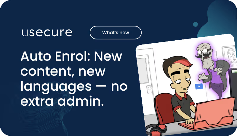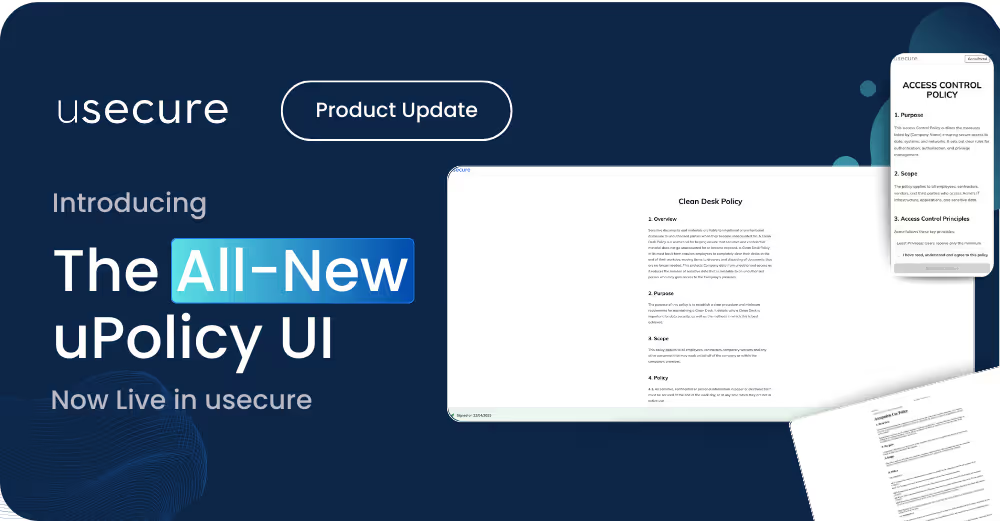

We’ve launched a redesigned uPolicy UI — built to make it easier for your users to review and sign policies quickly, clearly, and with confidence, whether they're at their desk or using their mobile.
This is the second phase of our ongoing redesign of all user-facing experiences at usecure, following the recent course UI update. The new uPolicy UI brings a modern, consistent design across the platform — with improvements to speed, accessibility, and engagement.
What’s new with the uPolicy UI
Faster performance, smoother experience
Policies now load more quickly and interact more fluidly across all devices. Users will experience improved responsiveness from the very first screen.
Fully mobile-optimised
Whether on a desktop, tablet or mobile, users can now review and sign policies effortlessly — without layout issues or zooming.
Modern, simplified interface
The updated design mirrors our new course UI, delivering a cleaner layout, improved accessibility, and consistent interactions from start to finish.
.avif)
Designed to drive engagement and completions
The new uPolicy UI isn’t just easier on the eyes — it’s built to encourage action:
Guided signing flow
After signing one policy, users are automatically directed to the next outstanding document — helping them work through all assigned policies without breaking focus.
Clear outstanding policy count
Users are shown how many policies remain to be signed, keeping expectations clear and motivation high.
Streamlined signature process
The signature confirmation step has been removed to reduce friction and speed up completion.
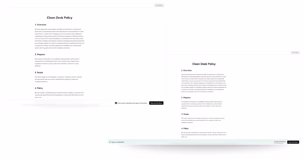
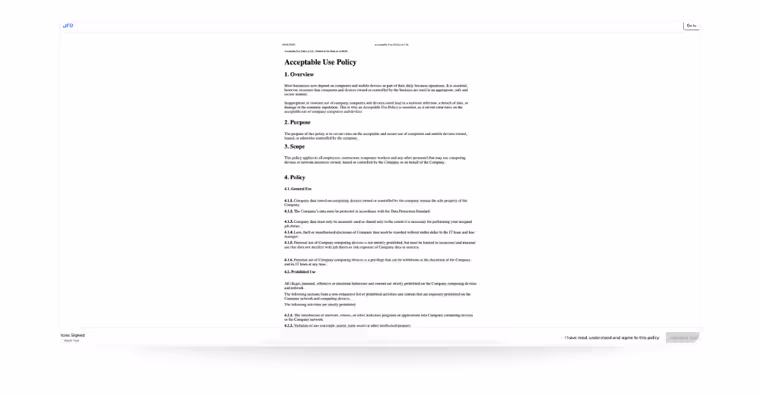
Refreshed PDF viewer
PDF policies now display in a cleaner, minimal viewer that supports a more focused reading experience. Formatting remains exactly as provided by your organisation.
PDF Policy Example - Please note we display PDF policies as provided by the client. The font and formatting will not be modified. This is true of both the current policy UI and the new one.
Why it matters
This update is part of our ongoing platform refresh, aimed at giving your users a more modern, intuitive experience across all areas of usecure.
With a faster UI, clearer progress tracking, and simplified signing flows, your users can stay compliant more easily — and you benefit from higher completion rates and fewer policy-related queries.
We hope you enjoy the new experience, and as always, your feedback is welcome!
— The usecure Team
Suscríbete al boletín

Descubre cómo las empresas de servicios profesionales reducen el riesgo humano con usecure
Descubre cómo los equipos de TI de servicios profesionales usan usecure para proteger los datos confidenciales de sus clientes, mantener el cumplimiento normativo y salvaguardar su reputación, sin interrumpir el trabajo facturable.
Entradas relacionadas
Descubre más análisis, novedades y recursos de usecure.